Thesis three options

1. Project base, a preparation of job base, create diverse projects.
2. Thesis base, one year study of a subject.
3. Master preparation thesis going in to deeper research.

reading 6 notes

The Reflective Practitioner: How Professionals think in Action

Donald Schon

Schon questioned of the relationship between the kinds of knowledge honored in academia and the kinds of competence valued in professional practice. He was convinced that universities are not devoted to the production and distribution of fundamental knowledge in general but inattention to practical competence and professional artistry. This study is an analysis of the distinctive structure of reflection-inaction. Schon argues that it is susceptible to a kind of rigor that is both like and unlike the rigor of scholarly research and controlled experiment.

In the university, there is a dominant view of professional knowledge as the application of scientific theory and technique to the instrumental problems of practice. Technical Rationality is the heritage of Positivism, the powerful philosophical doctrine that grew up in the nineteenth century as an account of the rise of science and technology and as a social movement aimed at applying the achievements of science and technology to the well-being of mankind. It became institutionalized in the modern university when Positivism was at its height, and in the professional schools that secured their place in the university in the early decades of the twentieth century.

From the perspective of Technical Rationality, professional practice is a process of problem solving. But we ignore problem setting, the process by which we define the decision to be made, the ends to be achieved, the means, which may be chosen. Problem setting is a necessary condition for technical problem solving.

Knowing has the following properties:

There are actions, recognitions, and judgments which we know how to carry out.

Spontaneously; we do not have to think about them prior to or during their performance. We are often unaware of having learned to do these things. We are usually unable to describe the knowing which our action reveals.

It is in this sense that I speak of knowing-in-action, the characteristic mode of ordinary practical knowledge.

Reflecting-in-action. If common sense recognizes knowing-in-action, it also recognizes that we sometimes think about what we are doing. “feel for the ball” that lets you “repeat the exact same thing you did before that proved successful.

When someone reflects-in-action, he becomes a researcher in the practice context. He is not dependent on the categories of established theory and technique, but constructs a new theory of the unique case. His inquiry is not limited to a deliberation about means which depends on a prior agreement about ends. He does not keep means and ends separate, but defines them interactively as he frames a problematic situation. He does not separate thinking from doing, ratiocinating his way to a decision which he must later convert to action. Because his experimenting is a kind of action, implementation is built into his inquiry. Thus reflection-in-action can proceed, even in situations of uncertainty or uniqueness, because it is not bound by the dichotomies of Technical Rationality.

Semiotics: A Primer for Designers

Challis Hodge

“Semiotics is important for designers as it allows us to understand the relationships between signs, what they stand for, and the people who must interpret them — the people we design for.”

Semiotics can be described as the study of signs that includes anything capable of standing for or representing a separate meaning. Paddy Whannel offered a slightly different definition. “Semiotics tells us things we already know in a language we will never understand.” Semiotics is important for designers as it allows us to gain insight into the relationships between signs, what they stand for, and the people who must interpret them — the people we design for.

Swiss linguist Ferdinand de Saussure is generally considered to be the founder of linguistics and semiotics. Structuralism is an analytical method used by many semioticians. Structuralists seek to describe the overall organization of sign systems as languages. They search for the deep and complex structures underlying the surface features of phenomena.

Semantics focuses on what words mean while semiotics is concerned with how signs mean. Semiotics embraces semantics, along with the other traditional branches of linguistics as follows:

Semantics: the relationship of signs to what they stand for.

Syntactics (or syntax): the formal or structural relations between signs.

Pragmatics: the relation of signs to interpreters.

Valentin Voloshinov proposed a reversal of the Saussurean priority, language over speech: “The sign is part of organized social intercourse and cannot exist, as such, outside it, reverting to a mere physical artifact.” The meaning of a sign is not in its relationship to other signs within the language system but rather in the social context of its use.

The study of semiotics needs to account for the relationship of the symbols and the social context or context of use.

Daniel Chandler sums up: “The study of signs is the study of the construction and maintenance of reality. To decline such a study is to leave to others the control of the world of meanings.” Semiotics teaches us as designers that our work has no meaning outside the complex set of factors that define it. These factors are not static, but rather constantly changing because we are changing and creating them. The deeper our understanding and awareness of these factors, the better our control over the success of the work products we create.

a book review

Today i read a book called "Flaunt: designing effective, compelling and memorable portfolios of creative work". It offered 40 graduate students' portfolios, by showing the detailed production process of their portfolios. The book also provides seventeen designers experiences reviewing portfolios and conducting interviews. It offers very practical and insightful advises that would allow us to create the most appropriate portfolio.

Here are some advices that interviewer are looking for:

- In the portfolio should provide skills and conceptual abilities.

- It must have excellent typography, color sensibility and composition. Nice concept, personality and style.

- Think about presentation, flow of work, consistency, the mediums that are used, and the details, quality, and printing.

- A portfolio should tell you someone’s interests and a sense of humor in the work is a plus.

- Thoughtful ideas and problem-solving abilities.

- Put strongest piece first.

- Well-designed resume.

- Don’t’ talk too much during the interview.

- Dong enough research about your reviewers. Ask enough questions after the person has looked at the work.

- Get personally professional. Ask about things you quickly observe in the environment. Show your portfolio and never - say anything negative about it.

- Ask for feedback.

- Build your network: ask for referrals, ask for directions and for advice.

- Good presentation skill.

- A follow-up thank-you note is appreciated.

Palacio, Bryony Gomez. Vit, Armin. Flaunt: Designing effective, compelling and memorable portfolios of creative work. Taxas: Underconsideration, 2010.

20 Fonts Ideal for Big and Powerful Headings

WDL introduced some 20 fonts that are ideal for creating big and powerful headings for your web designs.
Here are some fonts i think are good.
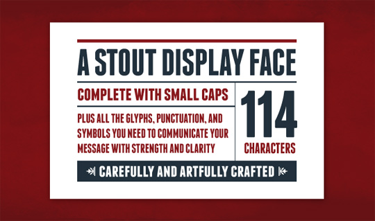
- Franchise
fonts
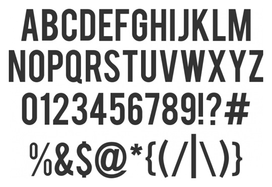
- Bebas
fonts
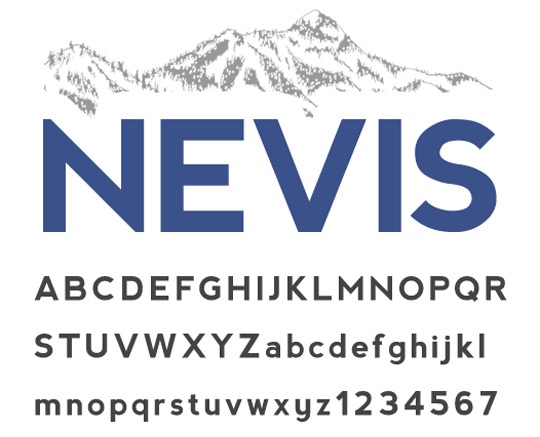
- Nevis
fonts
- fonts
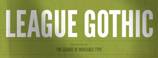
- League Gothic
fonts
- Old Sans Black
fonts

best sans serif typeface

From Smashing Magazine, it listed 80 beautiful typefaces. But i pick some that are pleasing to me.

- Helvetica
Helvetica in 80 Beautiful Typefaces For Professional Design
- Helvetica Neue
Helvetica-neue in 80 Beautiful Typefaces For Professional Design
- Univers
Univers-std in 80 Beautiful Typefaces For Professional Design
- Frutiger Std
Frutiger in 80 Beautiful Typefaces For Professional Design
- Avenir Std
Avenir-std in 80 Beautiful Typefaces For Professional Design
- Corporate, stable geometry subliminally offers reassurance
- School, grades 1-12, ages 6-17
- Creatives, use it as small as 3.5 pts
Avenir in 80 Beautiful Typefaces For Professional Design
- Myriad Pro
Myriad-pro in 80 Beautiful Typefaces For Professional Design
- Neuzeit
Neuzeit in 80 Beautiful Typefaces For Professional Design
- Gill Sans
Gill-sans in 80 Beautiful Typefaces For Professional Design
- Franklin Gothic
Franklin-gothic in 80 Beautiful Typefaces For Professional Design
- Futura
Futura in 80 Beautiful Typefaces For Professional Design
- DF Dynasty
Df-dynasty in 80 Beautiful Typefaces For Professional Design
- Eurostile
Eurostile in 80 Beautiful Typefaces For Professional Design
- FF Kievit
Kievit in 80 Beautiful Typefaces For Professional Design
- Olga
Olga in 80 Beautiful Typefaces For Professional Design
- Wingardium
Wingardium in 80 Beautiful Typefaces For Professional Design

best serif typfaces

I searched for some nicely designed serif and sans serif fonts online.
From "best design options", the top rated serif fonts are listed bellow.

Garamond -a great serif font for long bodies of texts such as in magazines, textbooks and websites
Caslon- good choice for text)
Baskerville- works well with text and display use
Bodoni- headlines and logos
Goudy Old Style- situated for both text and display application
Palaitno- This serif font is widely used for both body text and display type
Trajan- i doubt it will be rarely used because it was an old style that only available in caps.
Cambria- a very recently designed typface that come with Microsoft Windows Vista. It doesn't please to me.

Best Design Options. 10 Mar 2010 http://bestdesignoptions.com/?p=733

Other than the list above, I think these serif are also beautiful:
Times New Roman, Century, Palatino, Sabon and Stone Serif.

reading 5 notes

Why designers can’t think

Michael Bierut

Graphic design as structures of the world’s communications, we get to vicariously partake of in as many fields of interest as we have clients. more and more programs in graphic design at art schools, community colleges, and universities.

There are many ways to teach graphic design, American programs seem to fall into two broad categories: process schools and portfolio schools. Or, if you prefer, “Swiss” schools and “slick” schools. Process schools favor a form-driven problem solving approach. The Swlss-style process schools seem to have thrived largely as a reaction against the perceived “slickness” of the portfolio schools. Portfolio school aim: to provide students with polished “books” that will get them good jobs upon graduation. The problem-solving mode is conceptual, with a bias for appealing, memorable, populist imagery. The product, not process, is king. Unlike the fulI-time teachers of process schools, the portfolio schools are staffed largely by working professionals who teach part time, who are impatient with idle exercises that don’t relate to the “real world.” To the portfolio schools, the “Swiss” method is hermetic, arcane, and meaningless to the general public. To the process schools, the “slick” method is distastefully commercial, shallow, and derivative.

Both process schools and portfolio schools have something in common: what’s valued is the way graphic design looks, not what it means. Programs will pay lip service to meaning in design with references to “semiotics” (Swiss) or “conceptual problem solving” (slick), but these nuances are applied in a cultural vacuum. In many programs, if not most, it’s possible to study graphic design for four years without any meaningful exposure to the fine arts, world literature, science, history, politics or any of the other disciplines that unite us in a common culture.

Modern design education is essentially value-free: every problem has a purely visual solution that exists outside any cultural context. The design result will fail without exploring to a meaningful range of culture.

Extracts from I Come to Bury Graphic Design

Kenneth Fitzgerald

Author agreed that improving life is one of design’s ambitions, but it’s just not design’s primary objective. Design’s first concern is reproduction. It is assuring the creation of more professional design. To assure its existence, design strives to create a class of expert professional practitioners with high social standing. Design deliberately makes little real substantive effort to reach out to non-designers to explain what it’s doing and why.

A broader and deeper appreciation of design can, it leads to its demise as a specialist profession. A thorough appreciation of design should elicit the desire to do it yourself. It’s also the ultimate purpose of all the arts. We seek a society where everyone is making art, being creative. But if everyone’s an artist, then no one is.

Author agreed that untrained design could make inroads into information design. This might be considered the branch of design impervious to unprofessional interloping. Edward Tufte route into design shows design training isn’t necessary for someone to be considered a genius of information design. However, Tufte fails to account for the subjective realities of culture—culture as broad social forces and as smaller group dynamics. Design has a death wish. It constantly seeks to eradicate itself. Designers will instinctively reject this notion.

The notion that design is an on-the-job learning experience continues to dominate. A successful design program is defined as one that (re)produces more professional design and designers. There is the accumulation of knowledge for its own sake: the goal of the liberal arts.

It’s also surprisingly self-deprecating when comparing design to “true” liberal arts. Blauvelt said design education should strive for the idealism of education. Blauvelt is also correct that, at present, design study without application is unlikely. Academia promotes design education the way the field likes it—as practical. Swanson’s article makes no suggestion to dissociate from practice. Some students might find design study of interest while not intending to go on to a career of professional making. There is an oversight in Blauvelt’s critique that is reflexive for designers. For them, design education is entirely about producing designers. Swanson, however, is discussing education, in a design context. Here is a real world certainty every design educator must confront: the majority of design students will not go into professional practice. What is our responsibility to them? A shift in education away from a professional emphasis may also benefit students dedicated to a career of making. Designers claim their activity is all about ideas—not software, not formal facility. How it puts that idealistic pursuit into practice—education as menu of courses—is a major concern.

Business styles itself as rational, tangible, and methodical. The relationship between business and design is prickly because of the similitude. Still, design strives to be taken seriously on the business playing field.


Brenda Laurel Video: The Human Face of Research

Human center research informs creativity.

Design research used a lot of the same methodology as market research at human center form. Market research tells you how to sell something, design research inform how you decide at the first place.

Design shapes the future we are living in from the tool of design research.

Design process is about people and situated contexts. Part of design research is designing tools that helps you understand human subject and cast your finding in the way that let you see patterns.

Begin human center research and hang up by the door. Diploid different media types strategically to cohesive together.

The course of first year research, they deal with qualitative research and secondary research, conducting human center research. Design tools to look at the data. Formal research explores materials and forms- research topic and subject. From there, we move to scenario building and strategic analysis. Form a grand strategy and economic model. Proto-testing and branding.

Understanding people and situated contexts.

How can human-centered design research be conducted economically?

Deploy methods strategically, begin with quantitative data, identity patterns, use qualitative methods with sample sizes, and confirm findings with follow-up qualitative studies.

Focus group is complete waste of time among kids. Example of 14 years old situated contexts.

Research video shows more about situated contexts in terms of the experiences of the person.

Probes, example of six-year-old research. In our business, photo probes is common.

Analysis: reality maps, personas for baby boomers.

Outcomes from studio:

Missions: to inform, expand, and connect and hybrid car community

Missions: to inform and activate Baby Boomers around crucial social issues

Missions: to provide an attentive, personal means for tweens to relieve stress.

Tune your intuition: become a zeitgeist taster

Query the future: human change, human crises, sustainability and new ecologies of people and things

Human change: demographics, emergent social topologies

Human crises: health, extremism and conflict, climate change

Sustainability: design book “cradle to cradle”, materials and technologies

New ecologies of things: sensor networks, locative technologies, IP everywhere, open-source everything

Hope is an active verb, design is an active verb.

reading 4 notes

“On (Design) Bullshit”

Michael Bierut

What is the relationship of bullshit and design?

Harry G Frankfurt distinguished bullshit from lies, pointing out that bullshit is "not designed primarily to give its audience a false belief about whatever state of affairs may be the topic, but that its primary intention is rather to give its audience a false impression concerning what is going on in the mind of the speaker."

The design process always combines the pursuit of functional goals with countless intuitive, even irrational decisions.

Example: The functional requirements- the house needs a bathroom, the headlines have to be legible, the toothbrush has to fit in your mouth — are concrete and often measurable.

The intuitive decisions, I just like to set my headlines in Bodoni, or I just like to make my products blobby.

As Frankfurt points out, it's beside the point whether bullshit is true or false: "It is impossible for someone to lie unless he thinks he knows the truth. Producing bullshit requires no such conviction." There must only be the desire to conceal one's private intentions in the service of a larger goal: getting your client it to do it the way you like it.

Calling bullshit on a designer, then, stings all the more because it contains an element of accuracy.

"Wonders Revealed: Design and Faux Science"

Jessica Helfand and William Drenttel from Michael Bierut, William Drenttel, and Steven Heller

Science is the connective tissue linking past to present to future, and in this context, its relationship to visual communication is critical. It is through graphic design that the complexities and wonders of science are revealed.

why are there so few designers participating in the articulation, expression and dissemination of these new ideas? Why isn’t there a more central, intellectually relevant, and creatively meaningful role for designers—one that revolves less around aestheticizing preexisting content and is based, instead, on inventing new ways to visualize these new ideas?

This new seeking after scientific style- Faux Science—is the antithesis of Modernism: it’s form awaiting content, or worse, serious form retrofitted with interchangeable Helfand Drenttel 2 content.

Filtered through design’s brutally neutralizing style engine, contemporary design is anesthetized and stripped of its indigenous qualities: Science, in this context, is a graphic placebo. Meanwhile, designers conceal their intellectual weightlessness and flex their stylistic muscle, producing work that strikes just the right tone of Lab Chic.

Science is hygienic and objective, rational and finite, grounded in numerical certain and cosmological reason. Science is all about clarity and specificity and rationalism, about charting DNA strands and analyzing chemical compounds, about physical density and gravitational pull and a reality that is anything but virtual.

The appeal of information design is that it offers instant credibility.

Information design is rational and authoritative, classified and controlled to within an inch of its life: everything in its place and a place for everything. Label it information design and it looks serious. Number it and it looks scientific. But it’s a false authority, particularly because we buy into the form so unquestioningly.

Faux Science is the new vernacular, a methodology that, while highly disciplined in a formal sense, is still all about appropriation.

"The thesis proposal"

Michael Vanderbyl

A clear, well-written proposal will direct research, the form of thesis project, and its design.

1. Start with what interests you.

2. Make sure you have a point.

3. Do not base your proposal on the obvious.

4. Think through your claims.

5. Do not make sweeping statements for dramatic effect or without supporting them with documentation. Define your terms.

6. Do not claim what you will prove anything-we are designers, not cold-fusion scientists.

7. Do not claim that you will prove anything.

8. Be aware that you will revise your proposal as your research dictates and your process evolves.

Research tips:

Reading, visual audits, interviews and bibliography.

1. Let your topic dictate the type of research you do, and have an idea of what you are looking for.

2. Maintain a level of cynicism. Be critical of your sources, and do not merely adopt a point of view without reading competing sources.

3. Consult with an expert mentor in your chosen field of study.

4. Develop a system for note-taking as you read. Tansnscribe salient thoughts and quotes as you encounter.

5. Footnote your sources.

6. Avoid reading pseudo-science.

7. Interviewing all your friends about your topic is not research of intellectual merit.

The thesis project tips:

1. Do not have preconceived ideas about what form your project will take. Let the form the determined by your proposal and content.

2. Create a written outline of your narrative/argument diagramming your core and secondary messages. This outline, when paired with visuals and select research, will serve as a guide to the realization of your thesis project.

3. Give your audience “multiple access points” to your content. Deliver your information on several levels: the “quick read.” Or overview, as well as the elaborations. The overview will allow you to hook them and then lead them deeper into your content.

4. The visual language of your thesis should be appropriate to your subject/content.

5. If you are unfamiliar with your chosen medium, don’t assume you will successfully accomplish your project in ten weeks. Make realistic time allowances for the inevitable learning curve.

6. Approach the idea of creating an installation with some trepidation.